
Today, I’m going to share the behind scenes method I used to make a custom abstract landscape!
Making your own art is so fun and rewarding. With this method, its easy and doable for anyone out there, regardless of artistic background. You can adapt this to match any color scheme, and even go beyond landscape, the world is your oyster.
If you’re ready to get painting, keep reading!
Gathering Inspiration
I am in the midst of redecorating my guest bedroom and am looking for a piece of art to hang above the bed. The benefit of custom painting is that I can incorporate any color scheme—in this case, a mix of muted greens, beiges, and browns, with a pop of ochre yellow.
I have already purchased a throw blanket and some décor pillows, so I am going to keep these items to the side to refer to. I suggest you do the same.
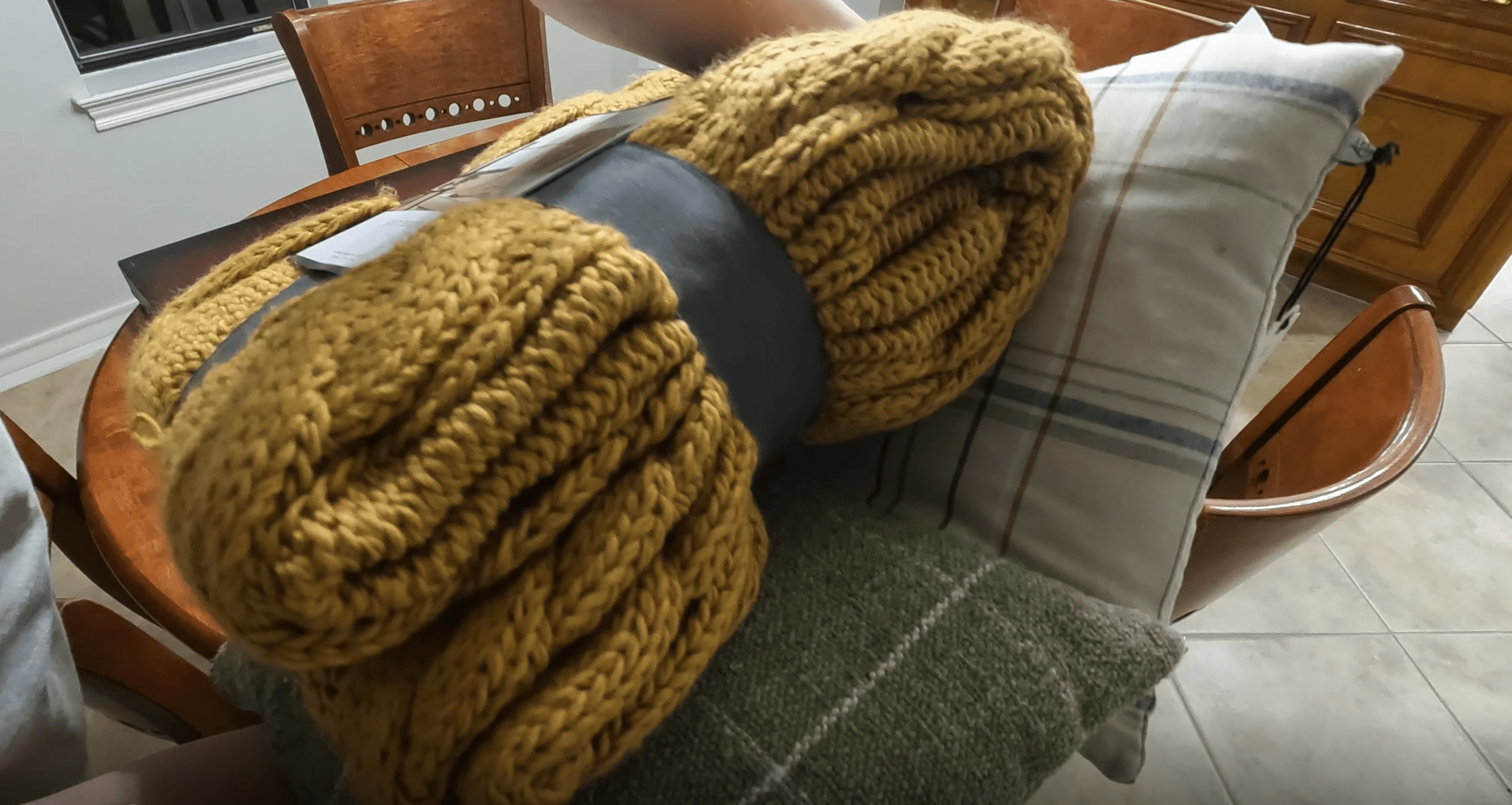 My Décor Pieces for Color Reference
I also know I want to paint some kind of mountain range or abstract landscape. After taking to the internet, I printed off some inspiration pictures - again, super helpful to have these on hand.
The first is a painting I saw in Target that I almost bought before I decided to DIY this project. The second and third are from an artist I follow on Instagram named Rebecca King. These three all have a similar organic, flowing, airy style I’d like to imitate.
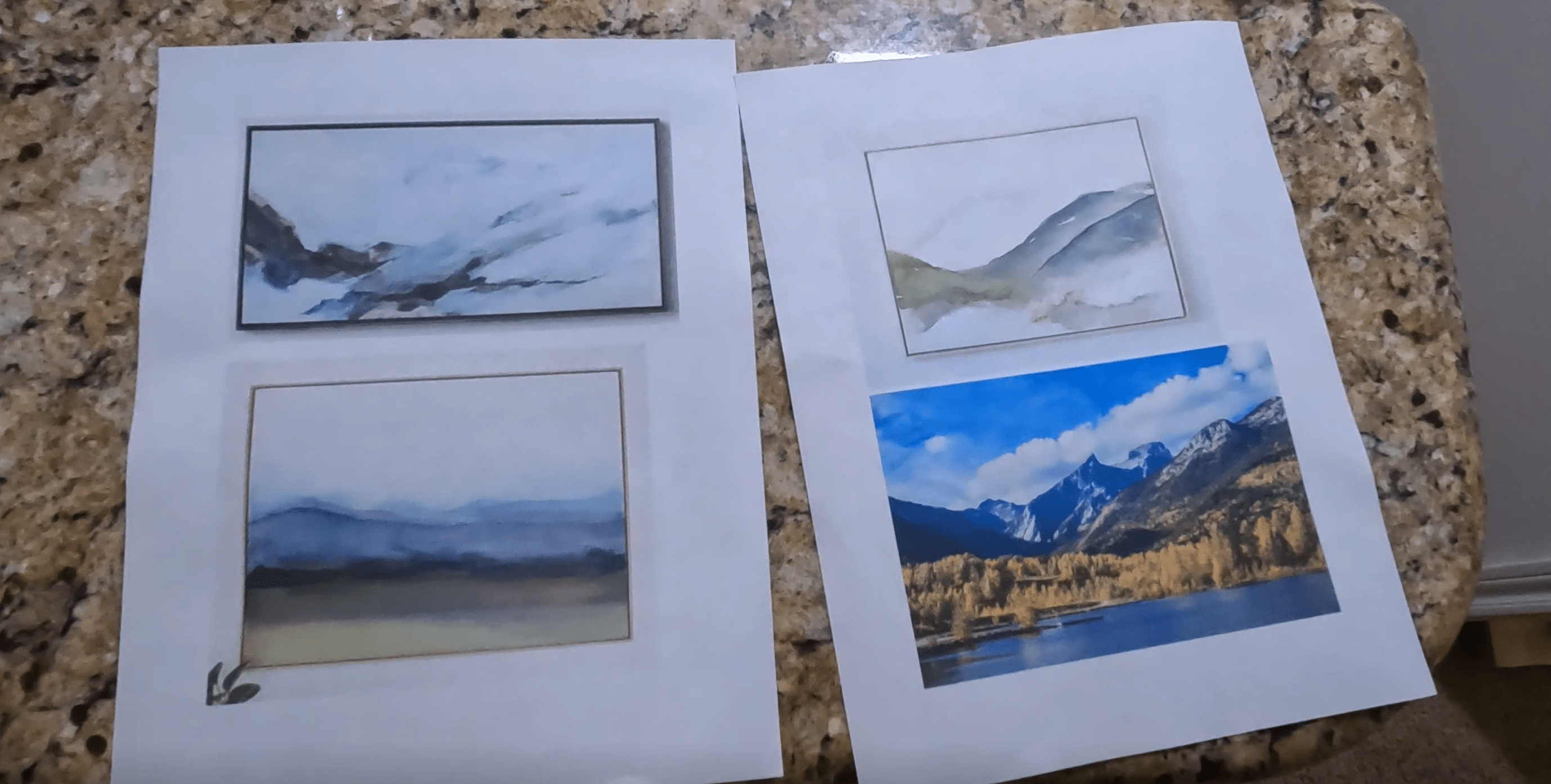 Various Inspiration Pictures
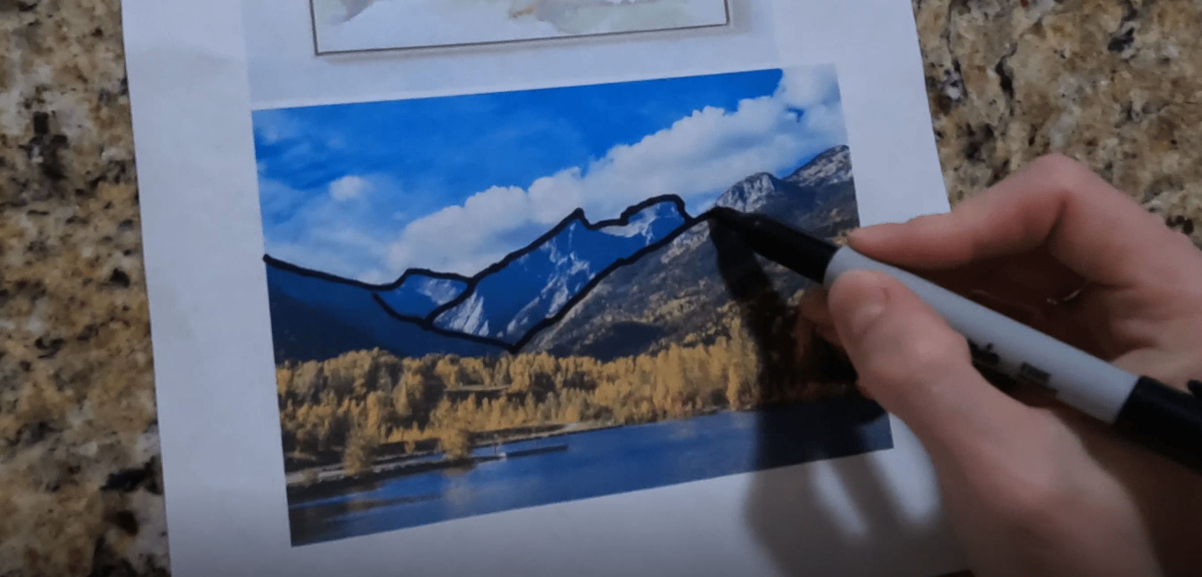
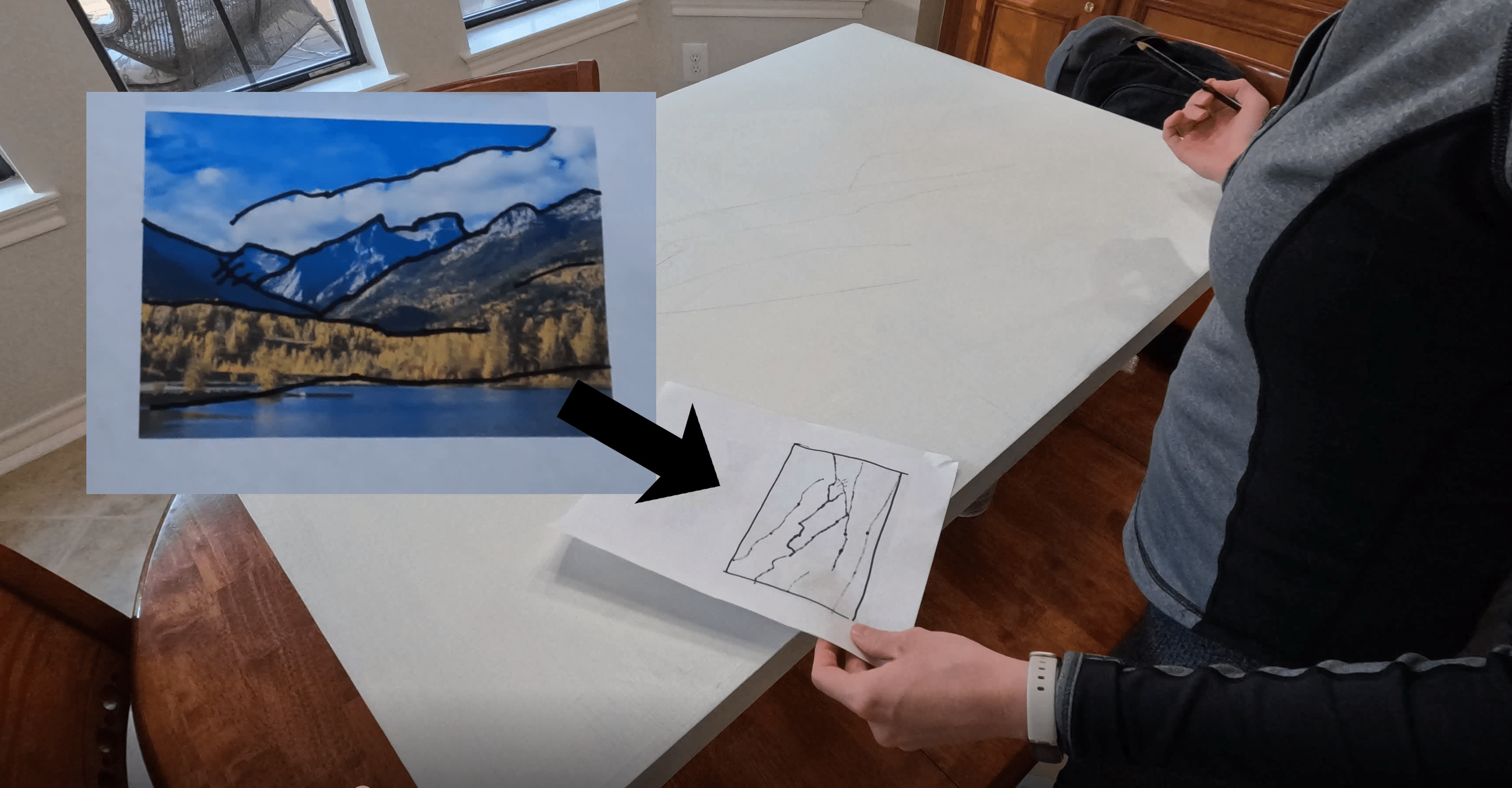
The final image is a picture of the Rocky Mountains that I’m going to use as a composition reference. I’m actually going to trace the major features of this image with a sharpie: mountains, hills, etc.
You’ll see why in a minute. For now, we have all our prep done, so let’s get started painting.
 Tracing the Composition Reference Image
Preparing the Canvas
I got a large used canvas from Goodwill for $12, but you can also buy new from Michaels, Joann, or any other craft store. This thing was very dusty, so I made sure to clean it up well with a gentle cleaning spray before I began.
The first step is to reset the canvas back to a blank page. I grabbed an old paint sample from Lowes in warm white color called Alabaster and did a nice smooth layer all over.
The paint underneath this is acrylic or latex, so this paint sample paint will stick fine for me, but if you have any concerns about adherence or longevity, this would be a great time to use a quality primer or even an artist’s gesso.
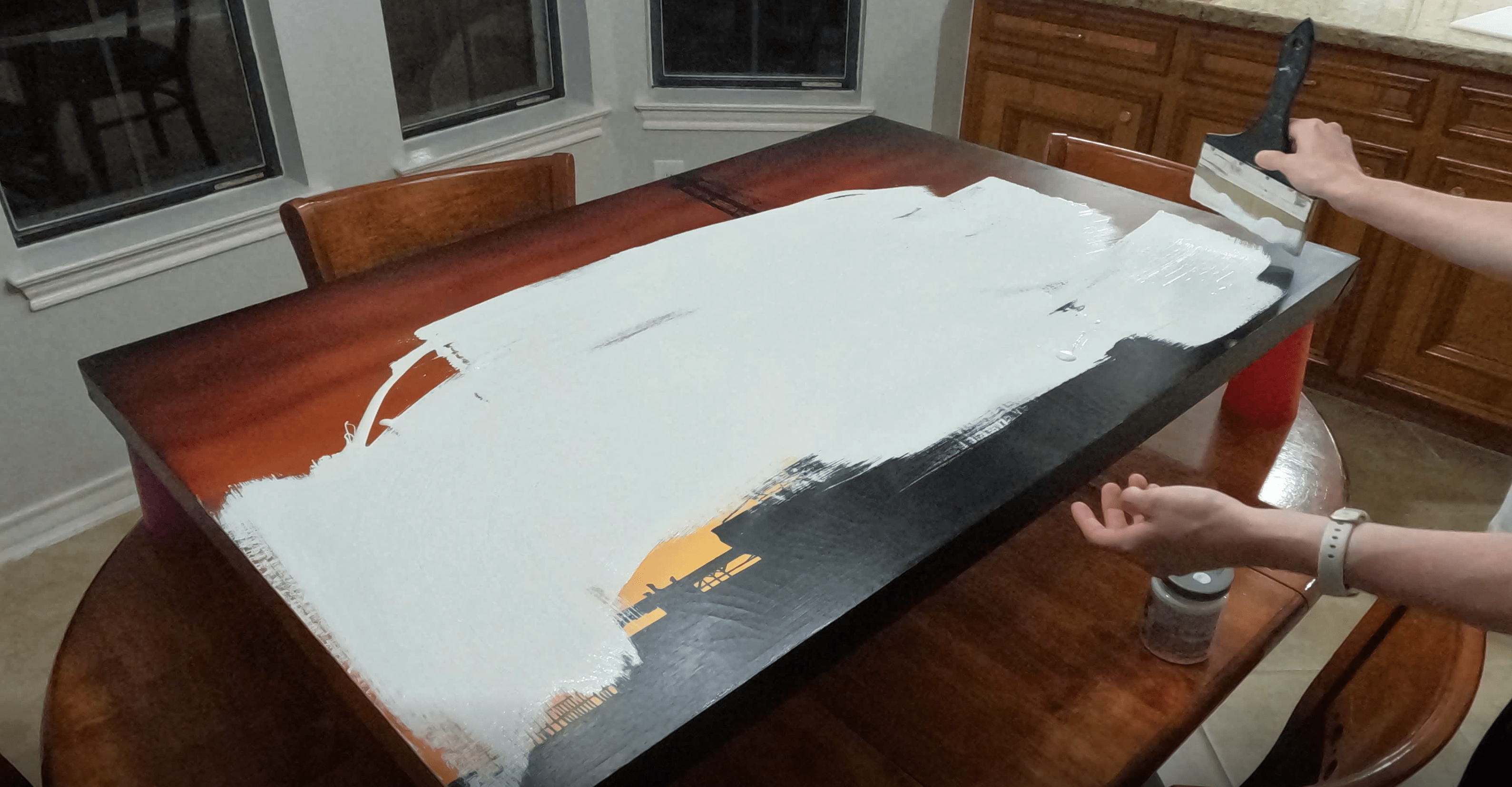 Covering the Previous Artwork
Transcribing the Reference Image
Once that’s dry, it’s time to transcribe my reference photo onto the canvas. Remember the sharpie lines we drew onto that mountain photo? All I did was flip the page over and where the sharpie bled through, I now have a simple inverted outline to trace onto the canvas.
Composition is one of the hardest parts of making good art, so If you’re a beginner, this is such a great hack to let nature do it for you. I’m tracing in pencil, which also allows me to make any adjustments as needed until I’m happy.
 Transcribing the Reference Image
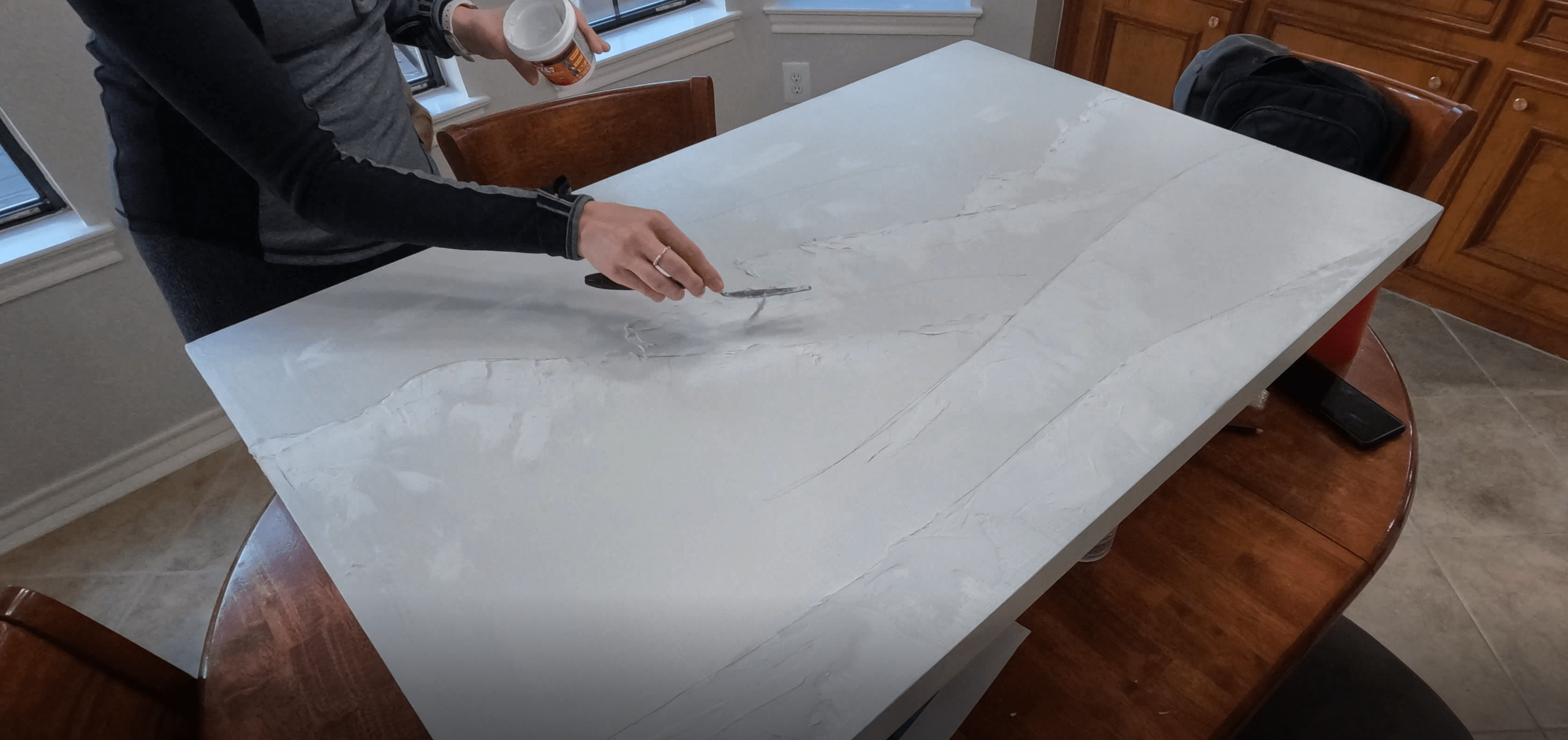
Adding Some Texture
The next step is optional, but a lot of fun.
I wanted to add an organic texture to my canvas. I’ve seen a number of people use joint compound on canvas so I thought I would try it out. I grabbed a little jar of spackling and a putty knife and started to apply the plaster along the ridge of my mountains. I used my picture as a reference to see which areas should be rock versus grass versus trees and let the putty knife flow as loosely as possible.
Doesn’t this look awesome? Adding organic textures or unplanned elements to your art is a great way to step up the visual interest, especially when the subject is something natural like a landscape. You don’t have to plan it all out, let nature do the work!
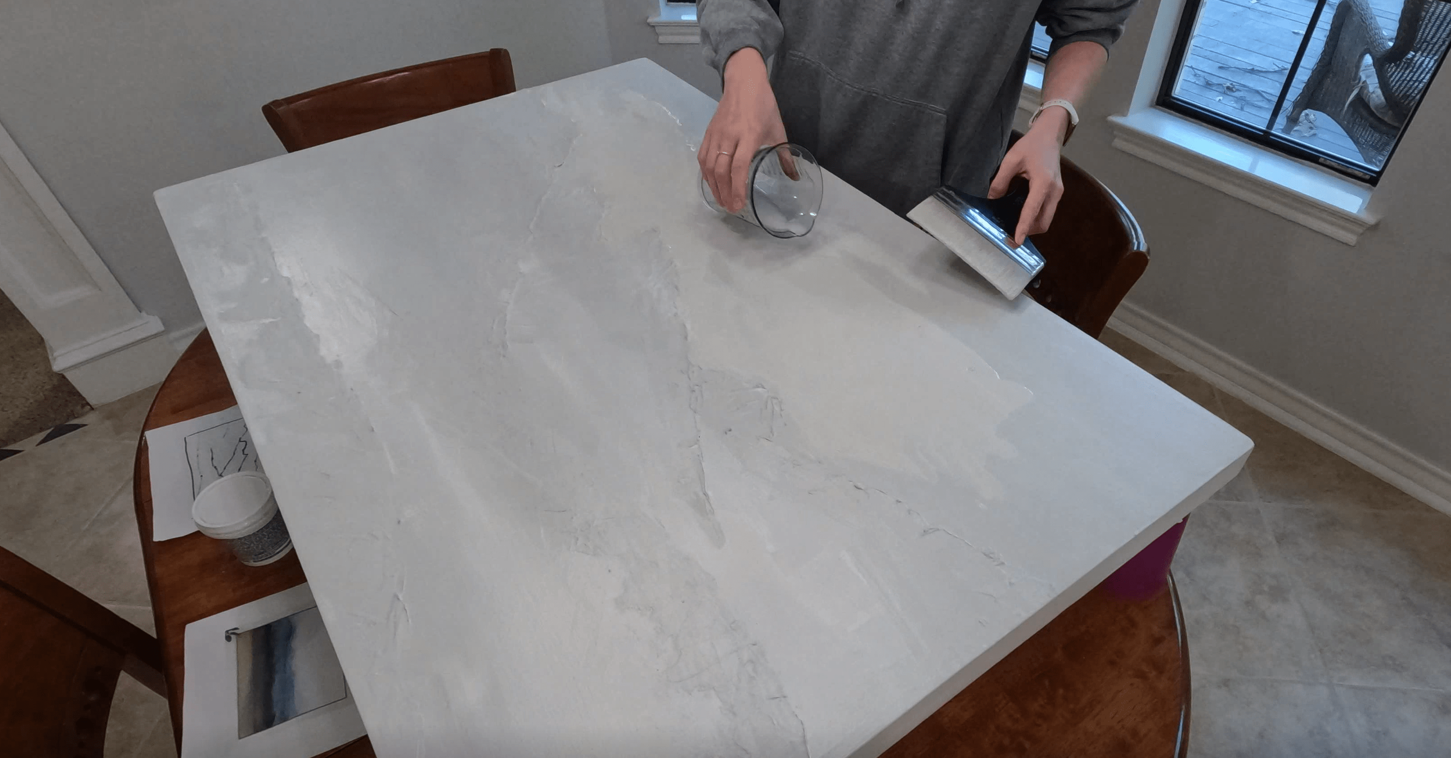
Once the spackle dried, I wanted to do one more base coat to seal it in and also to make sure all of the previous painting was completely covered. I was running low on the Alabaster white color, so I went through my paint box and grabbed some other colors to mix together - a great way to add some subtle depth!
 Applying Spackle for Texture
Painting the Sky
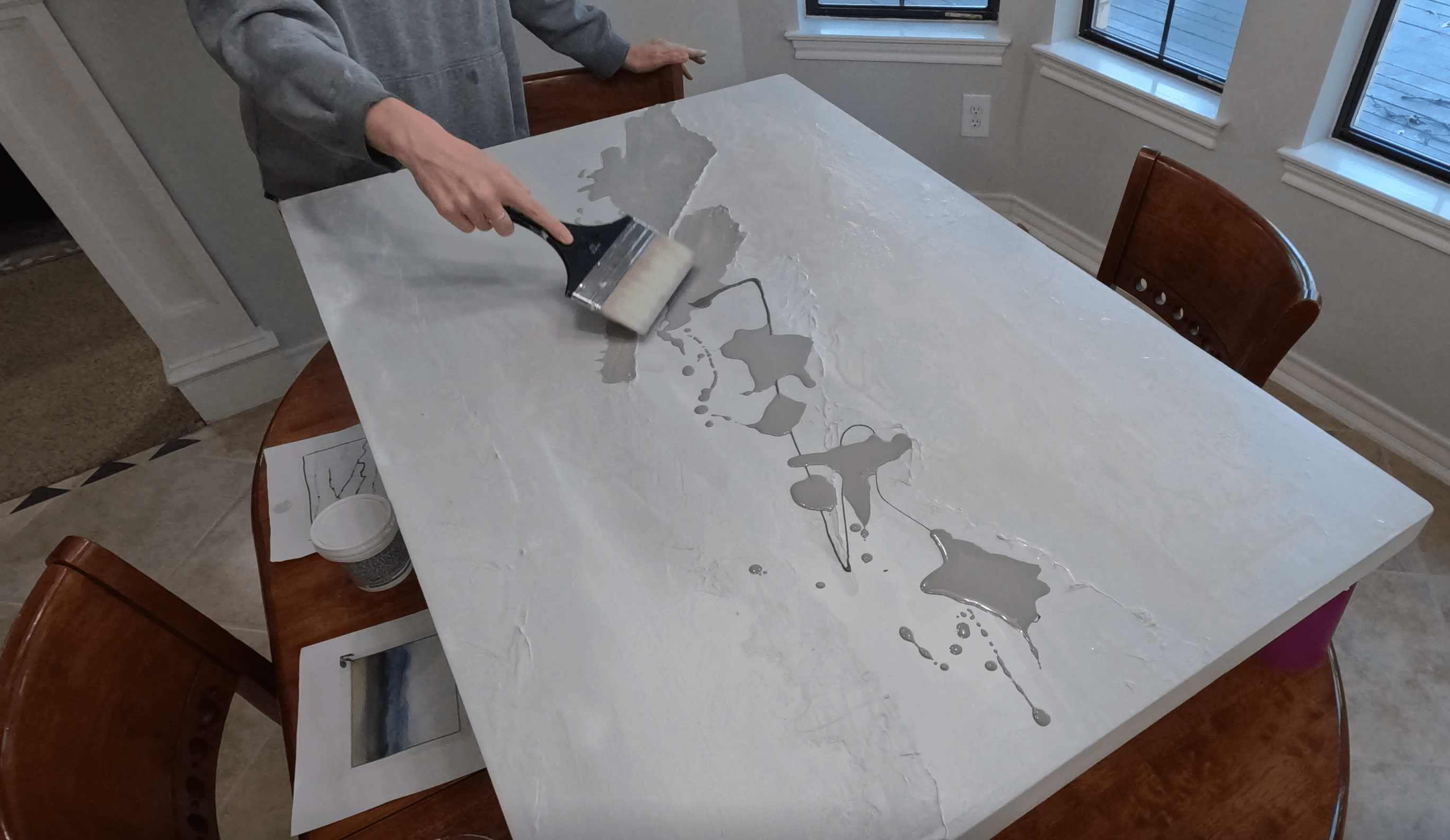
I’m going start at the back of the image and work my way forward, which means we’re starting with the sky.
I wanted to do a watery wash, so I am diluting some grey and beige paint with water in a 50/50 ratio. Then I’m going to spread that in splotches across the sky area. I know its a bit hard to see, but I’m essentially letting pools of water form and they collect more paint pigments in certain areas and leave them behind when the water dries off. This gives a very subtle, overcast look.
 Applying a Grey Wash to the Sky
Blocking Out the Mountains
Once that was dry, I moved on to the mountains. This time, I did a dark drizzle of gray paint directly onto and then splashes of a medium grey wash on top. When the water meets the darker drizzle underneath, it blends the two colors together to make a mix of saturation.
I’m using my brush to press the paint just up to the edge of the plaster texture, making sure I don’t have any runoff into the sky. I’m also dragging it down as far as I’m guessing the mountains go.
 Blending Paints while Blocking Out the Mountains
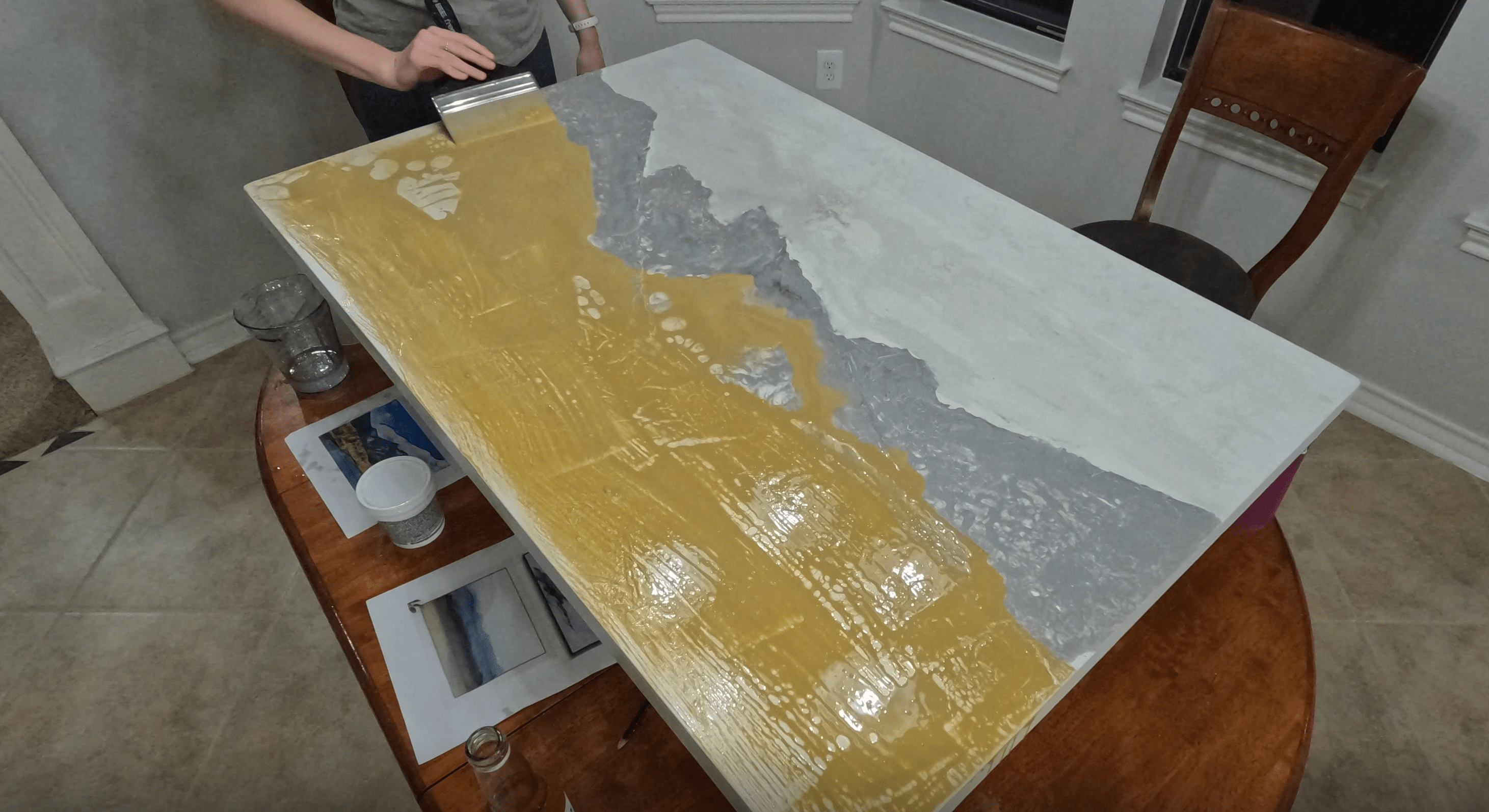
Adding Some Color Depth
Now for something fun! An important part of abstract painting is to add layers!
Remember the pop of yellow from my color scheme? I know I need to incorporate it somewhere, and I figured a base layer on the whole “earth” section of the painting might be a good place to start.
This might look a little shocking right now, but trust me, it’s going to be toned down a lot with subsequent layers, and will help provide subtle cohesion between the mountains and grass. I did grab a paper towel and dab away at some of the mountain peaks where I felt the paint was covering a bit too much.
 Adding Some Depth of Color
Blocking Out the Hills
Time for the grassy hills, which follow a similar wash process. I want to note here that with every color I mix up, I am referring to my color palette—the blanket and décor pillows—to make sure I get it just right.
Mixing muted, natural colors by hand can be really complicated—that’s why I love samples! It’s so great to pick a paint chip off the shelf and know exactly what I’m going to get.
 Blocking Out the Hills
A Note on Mixing Custom Colors
If you do want to mix custom colors with acrylic paint, I do have a great hack for you – it’s a web tool called Paint Maker by Sensual Logic
It will create a recipe for you to mix any color from a number of popular paint brands. There is a paid version to add all the colors you own, but I find the free version is all I need. Select a paint palette that includes a basic red, blue, yellow, white, and black, then insert the HEX code for your color of choice, and click “Calculate Recipes”.
Ta-da. Looking at the first result, the recipe is calling for a majority of white, a good amount of yellow, and a bit of red, blue, and black. Follow those proportions and you’re in good shape! Super helpful, right?
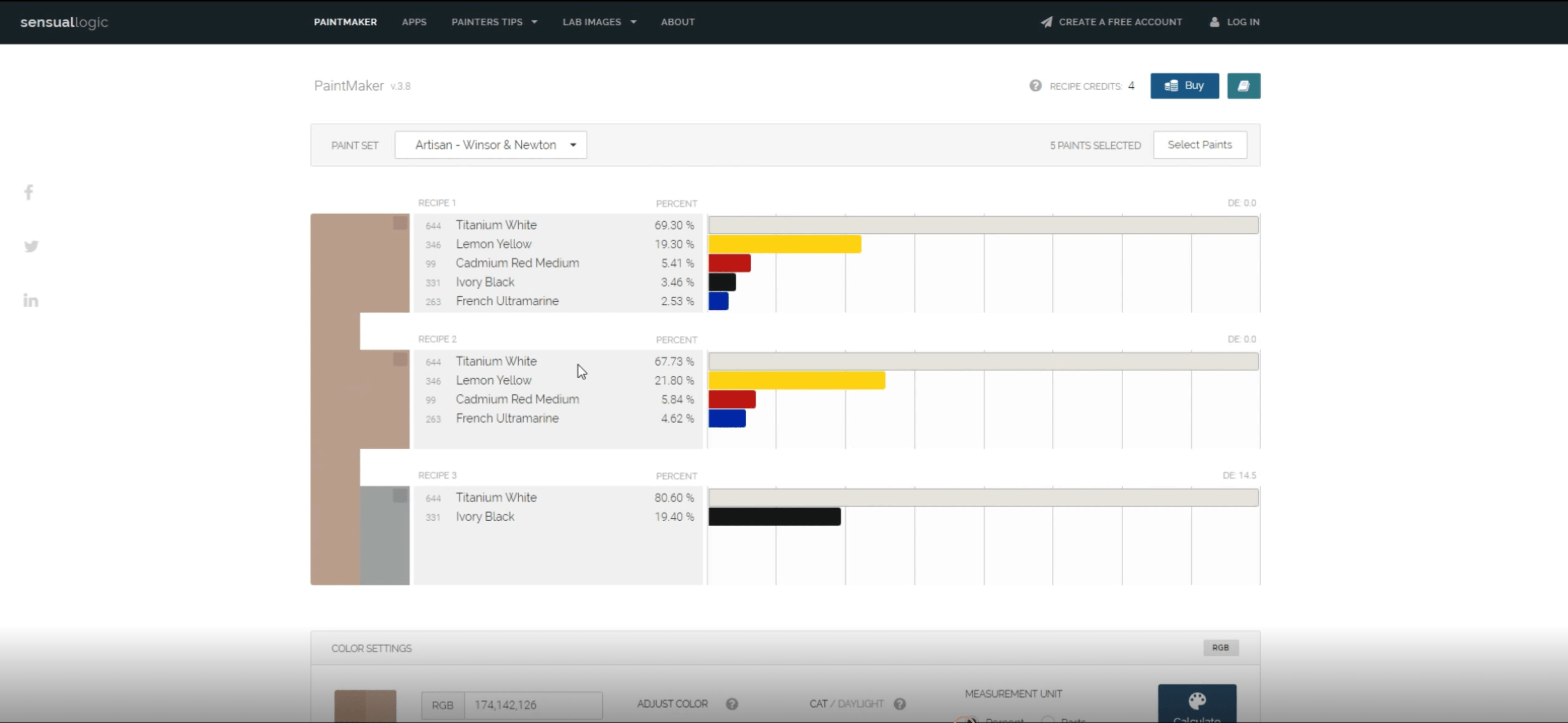 SensualLogic PaintMaker Color Mixing Tool
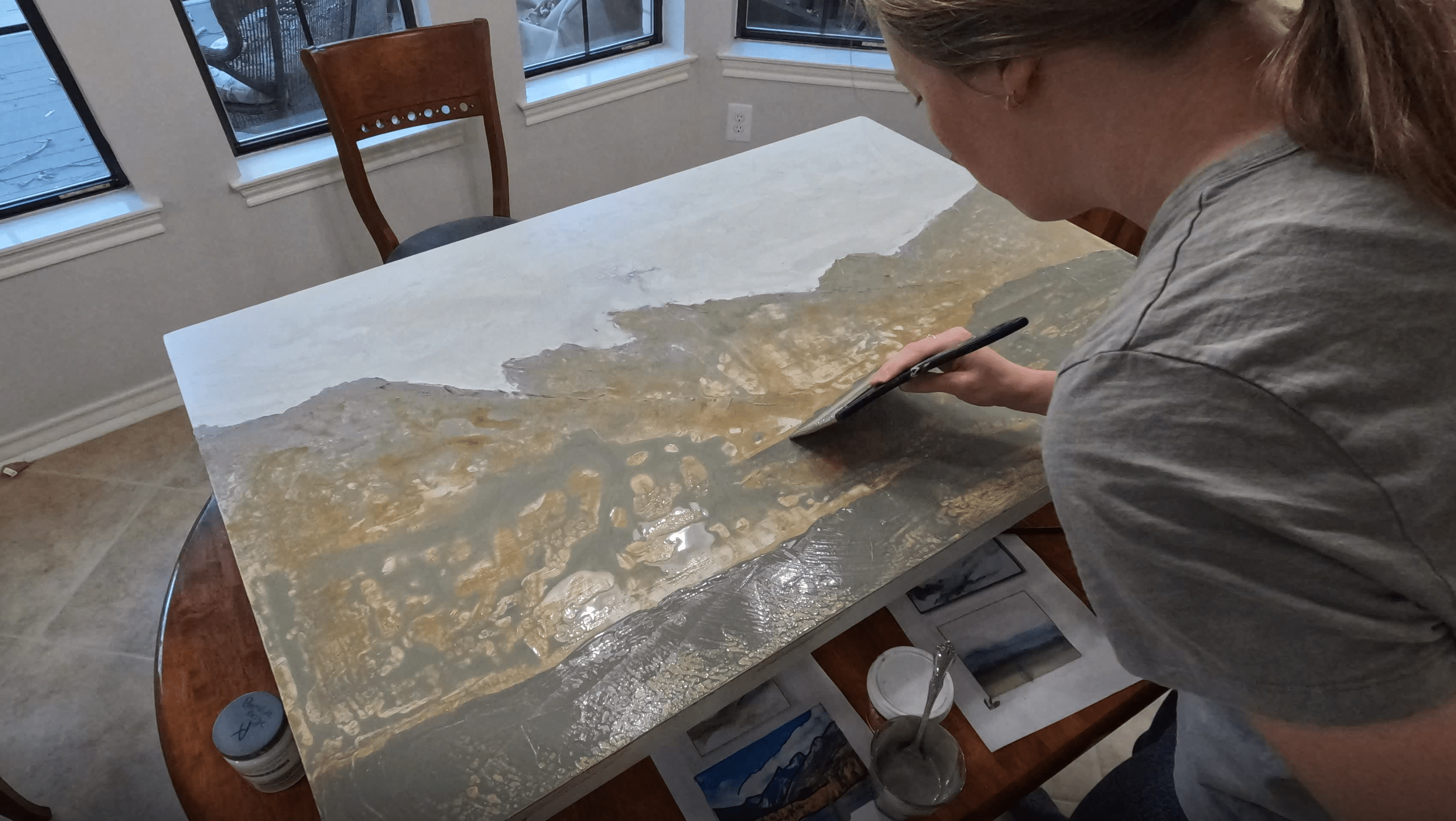
Keep Adding Color!
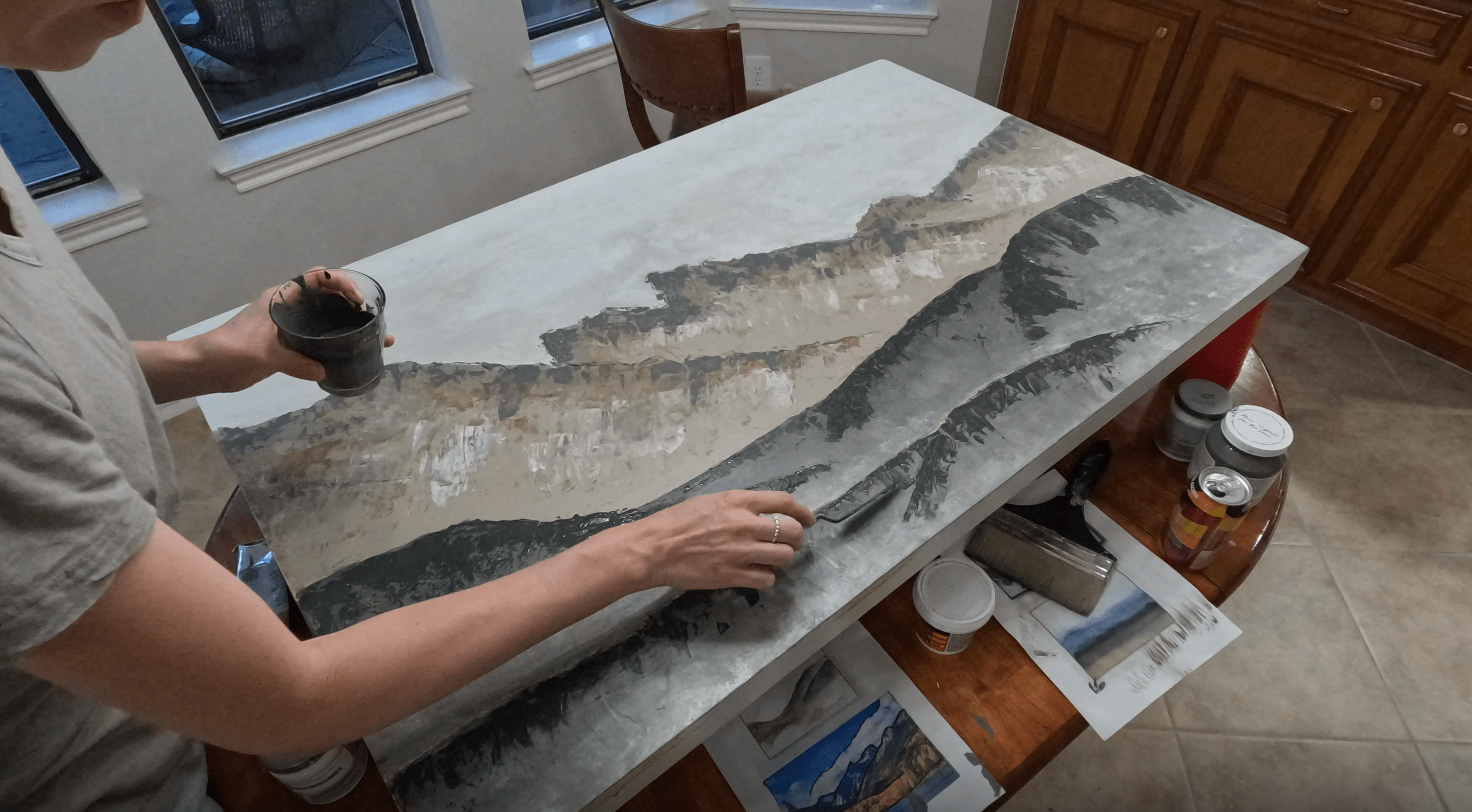
Alright, back to painting. I don’t love the yellow on the mountains—it looks too much like grass. So I’m going to take a pinky beige, another color from my color palette, and scrape that on with a putty knife.
Between the spackle we put on earlier and the various layers of paint, we have enough texture on the canvas that I can use the putty knife similar to a dry brush—just catching the high spots. I can also apply paint and scrape it back gently to achieve streaks. This is another great way to add organic texture. Are you seeing a theme yet?
I’m going to do the same knife technique with some white paint as well as dark grey at the ridges of the mountain. We have our major shapes blocked out so it’s now a matter of detail. An easy way to add detail is to think about highlights and shadows.
 Adding Highlights & Shadows to the Mountains
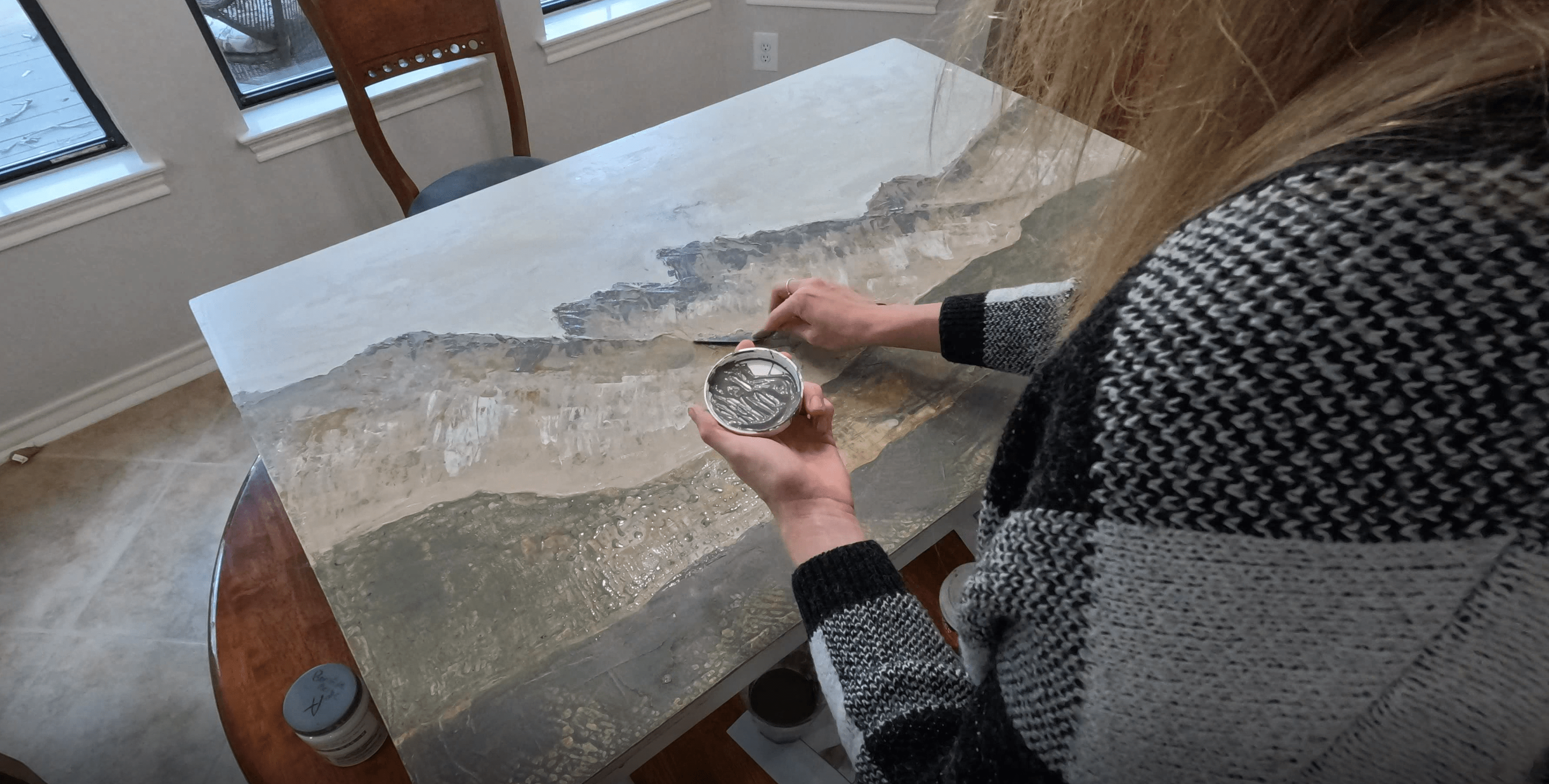
You can see this process again in the hills—I’m going to add a highlight along the bottom of each hill, almost like mist, and then a darker green along the ridges to make them pop off the background.
 Adding Highlights & Shadows to the Hills
Take a Step Back
Don’t forget to stand back now and then to get a feel for what’s working and what’s not. In this case, I felt like the hills were way too bold and overpowering the mountains, which I wanted to be the main feature. So I went back and blended a bit to tone them down.
Final tip—done is better than perfect! Artists can be their worst critic so remember that perfect does not exist! At this point, your painting is beautiful and deserves to be hung! So let’s move on to a bonus how-to: custom framing.
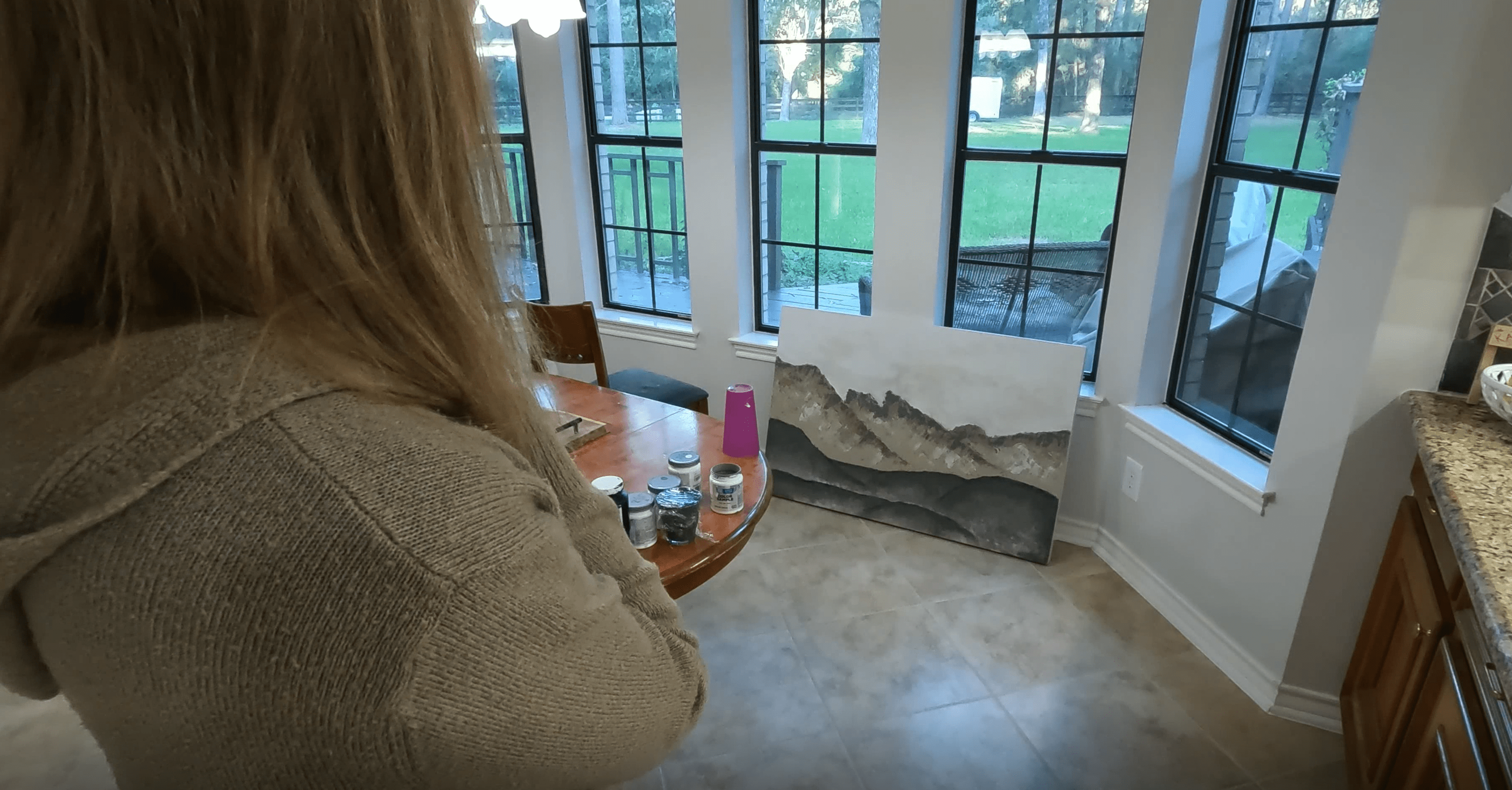 Taking a Step Back to Evaluate
Cutting a Custom Frame
I grabbed some select pine 1x3s from the hardware store And marked out where I needed to make 45-degree cuts, one cut at a time.
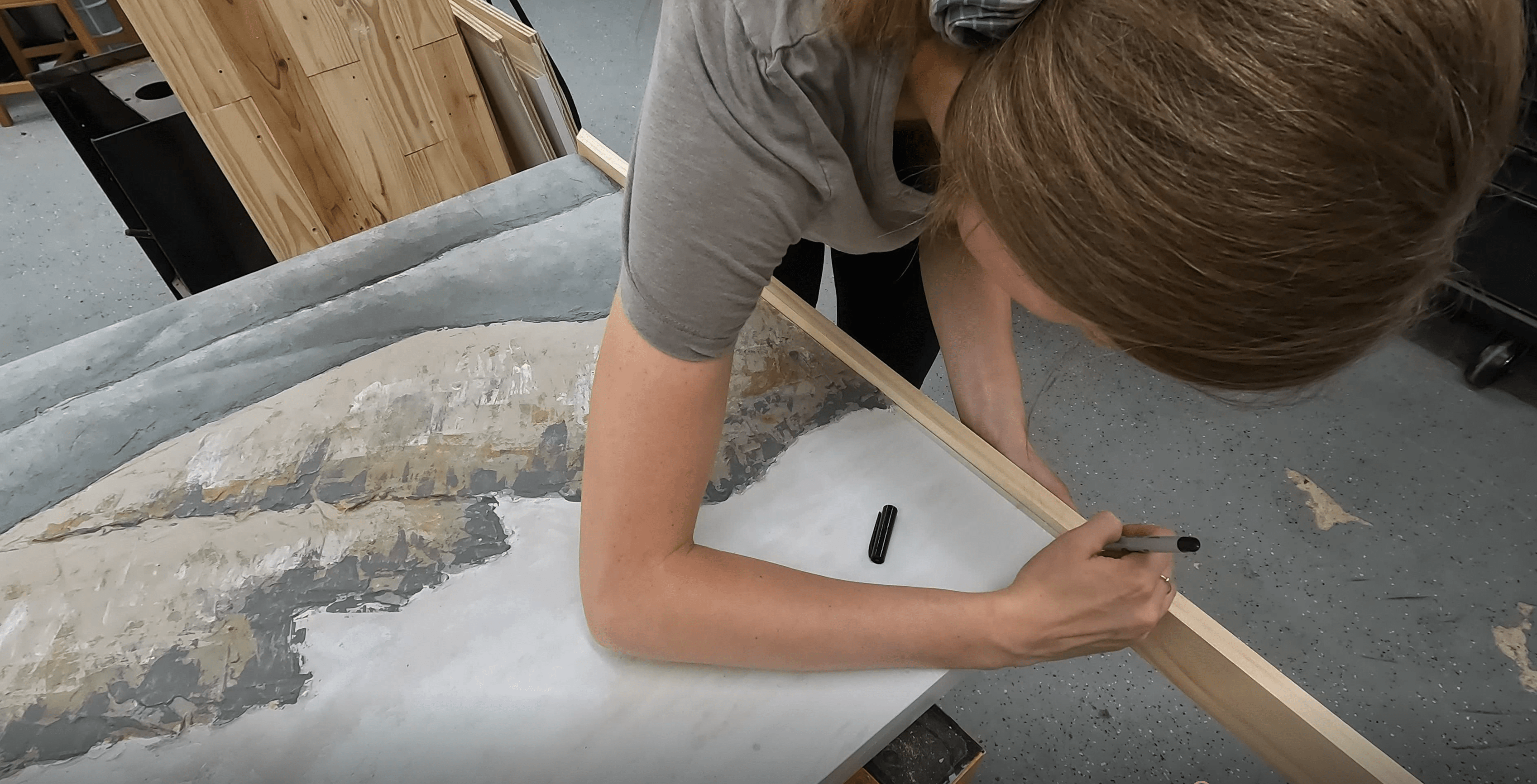 Marking the Length
Then, I decided to go old school and cut these with a hand saw using this simple plastic jig my husband picked up at a garage sale. Pine is soft, so it took a minute or two to get through each piece. You can definitely use a miter saw for this, but be aware that the 45-degree marking on your miter saw might not be perfect, so be sure to cut a test piece and measure it with a speed square or protractor until you get the right angle.
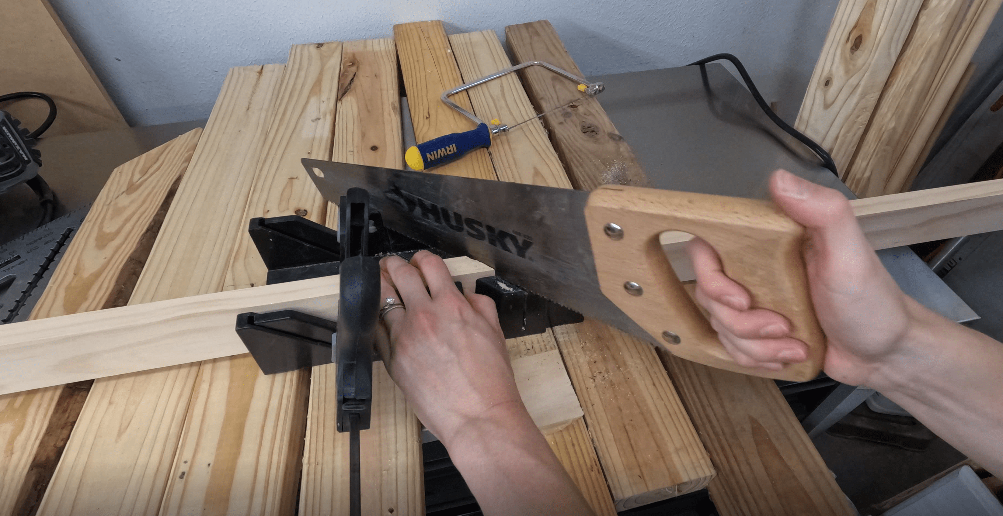 Cutting the Select Pine with a Miter Jig
Once I had my groove going, I needed to repeat and repeat and repeat! I did a dry fit, and once I was happy with everything, I grabbed some Varathane wood stain in the color Early American and did a quick coat on everything. Then it was time for assembly.
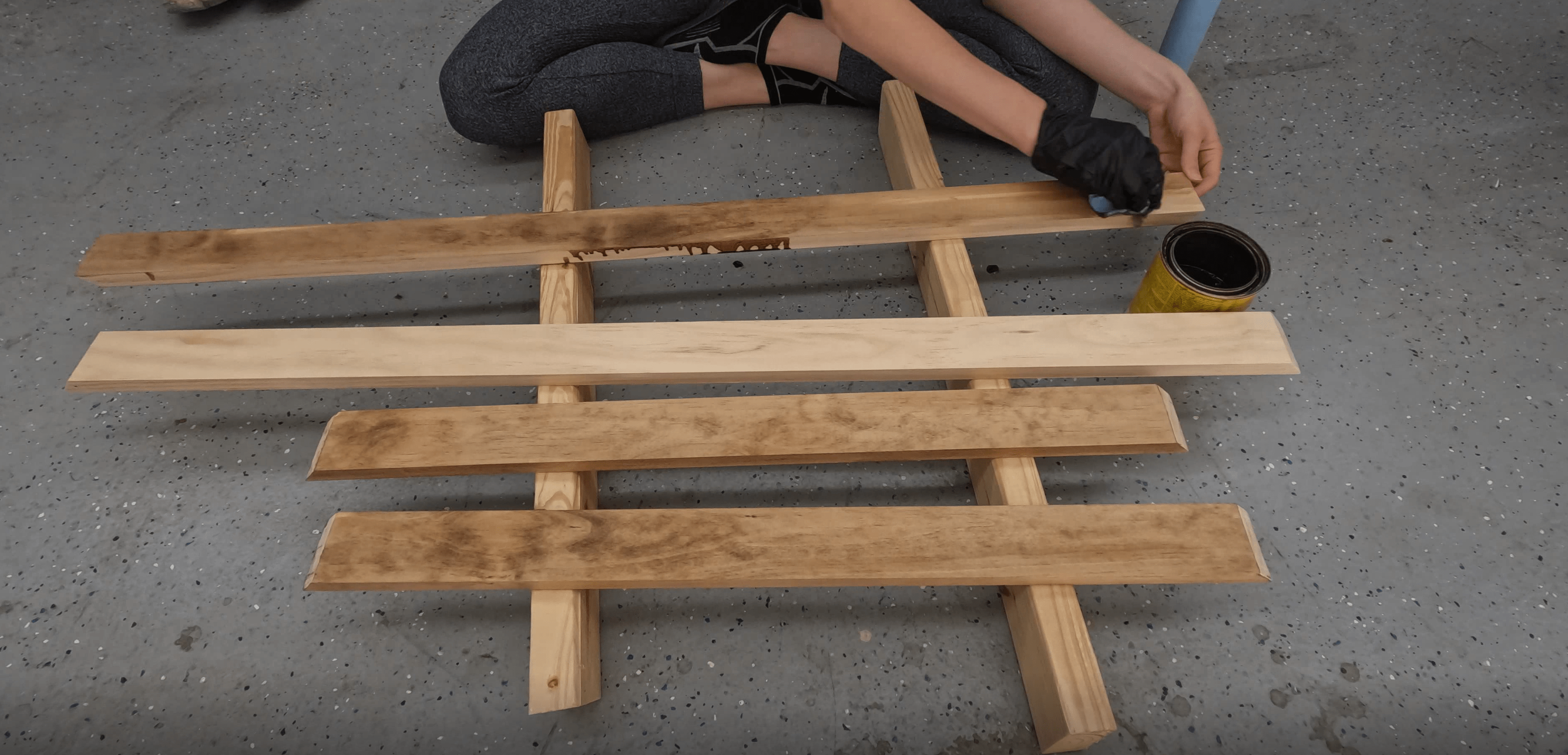 Applying Stain
Installing the Frame
We laid the painting on the ground and then clamped the frame pieced gently into place so they stayed straight, level, and aligned. Then went around with a brad nailer and tacked in each piece one at a time—you can also use trim nails with a small hammer. It was a bit fussy so definitely helps to have an extra set of hands. We also did our best to protect the painted surface from any dings or chips.
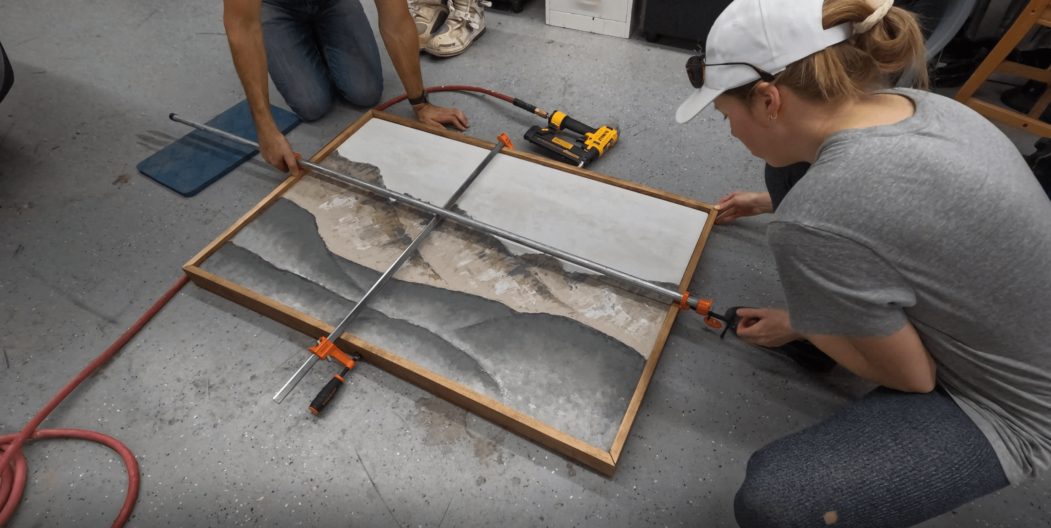 Frame Installation
Once that was done, I grabbed some stainable wood filler and filled in any small gaps in the joints—unless you're an expert woodworker, it’s going to be near impossible to get everything lined up perfectly—so don’t worry, the filler is here to help you get a perfect finish! Once that was dry, I needed to sand back any excess and dab on a bit more stain, and we are ready for the final reveal!
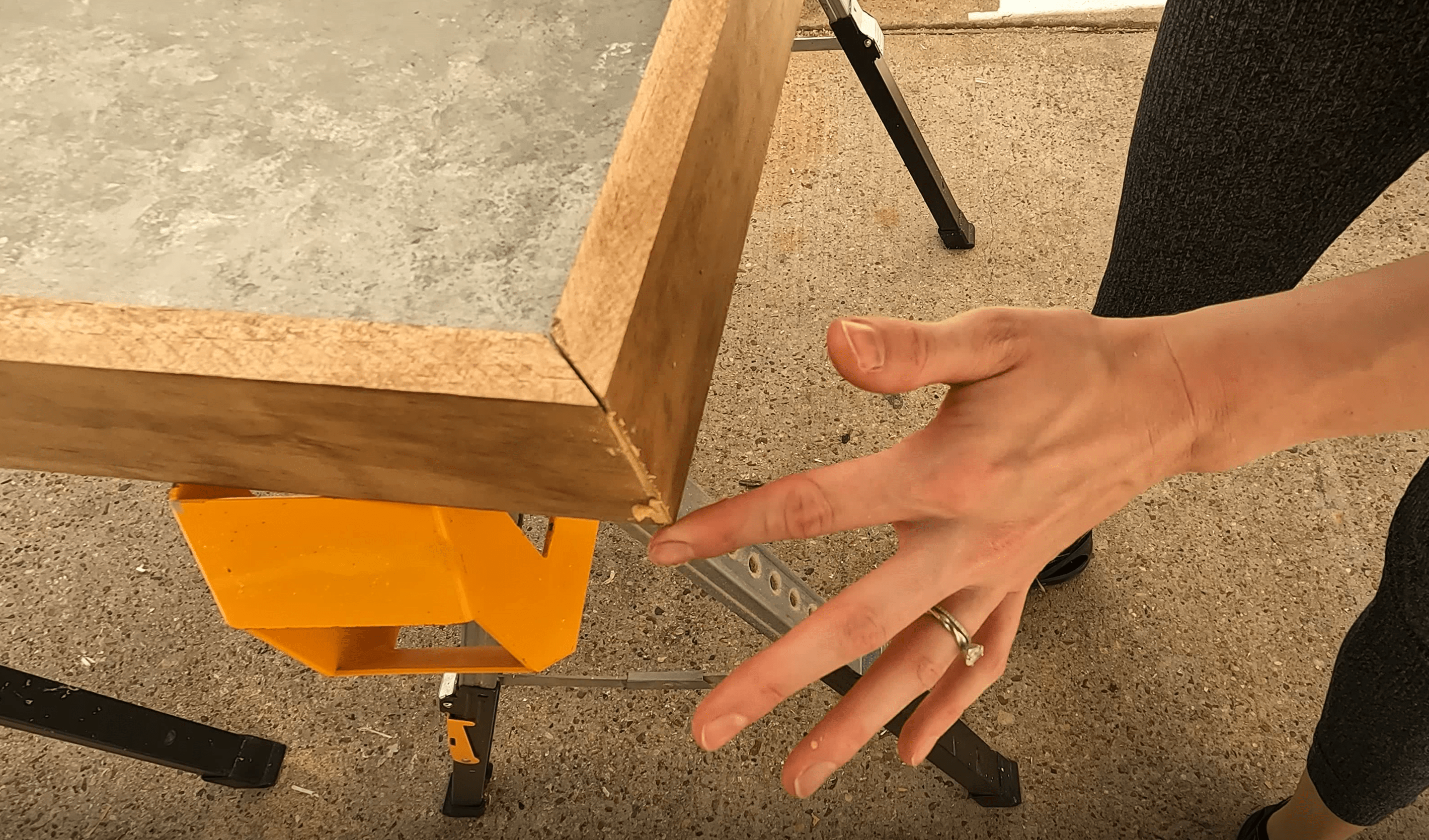 Applying Wood Filler to Any Gaps
The Reveal
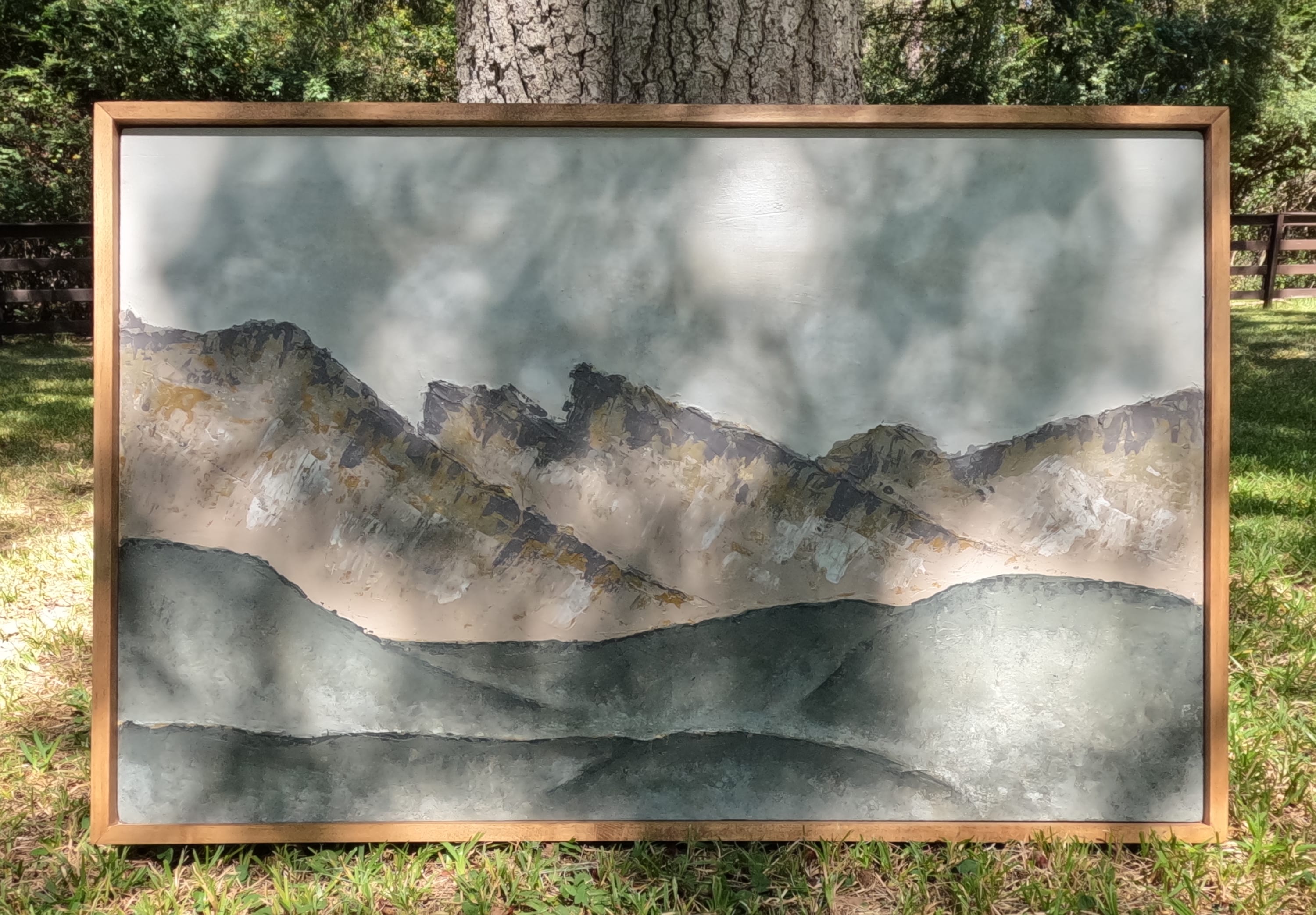 The Final Result
I’m so happy with how this turned out. Better yet, I love how it pulls together the new linens in my guest bedroom.
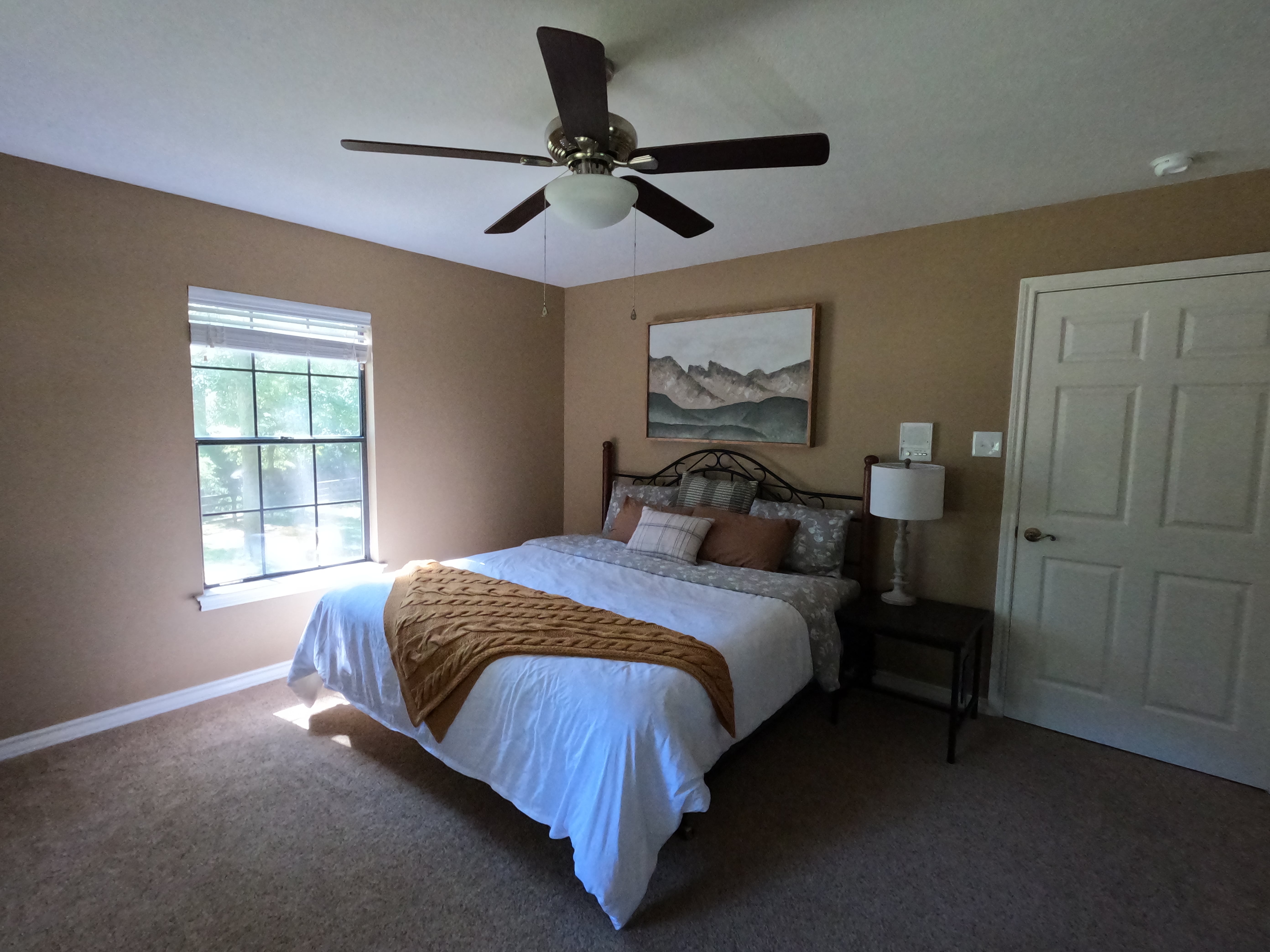 Installed in the Guest Bedroom
I really hope you try this for yourself and let your creativity shine! Seeing this on the wall is so much more gratifying to me than store-bought art. I want you to feel that feeling too, so get out there and get crafting. I’ll see you next time!